

Pouch Airlines
I created a trustworthy and kid-friendly Airline System tailored towards helping kids overcome their fear of flights.



Don't want to read? Listen to a brief 2 minute overview of my project. Audio is not necessary, but will increase enjoyment of case study.
TIMELINE
10 weeks
SOFTWARE
Figma, variables and conditionals
TYPE
Design systems case study
What started off as an unserious topic became a well thought out design system with the purpose of making a kid-friendly flight booking app to ease their anxiety flying on an airplane.
Jump to…
The Design "Joey" System

As a school project, we chose our own fictional airline and created a design system around the theme we chose.

Process work

An experimental project of a Tic Tac Toe board created fully using Figma Variables and Conditionals set the confidence I had to create an entire design system.
Flight patterns and system planning
The Joey System
Colors, typography, buttons, illustration, logos, icons, breadcrumbs, and drop downs.
The Tic Tac Toe warm up
Navigating the space of storing Figma variables and using conditionals.
Prototype
Figma variables and conditionals.
Reflection
Takeaways.
Flight patterns and system planning
Planning flight time iterations and patterns with 3 different planes in 4 different locations along the east coast of Australia.

Gold Coast Airport (OOL) was used as the home base for my flights to start and end the day at. I calculated the time it took to fly and the layovers for each of the 3 planes.

With precise planning, timing, and aligning planes with layovers, I calculated and mapped out a few iterations of times and flights with connected layovers and at least 1h and 30m between for flight cooldown and getting ready for the next passengers.

All 3 flights are within a 24 hour time span and each one heads to and from every location.
The Joey System
Pouch Airlines’ Design System that sets the guidelines for each and every design decision that breathes life into Pouch Airlines.

Colors
Consisting of primary and secondary colors, the Joey System utilizes an array of different shades for different contrast ratios.
Typography
ll text is based on a 4pt and 8pt scale. This includes a minimum size type of 12pt font and a max of 96pt font to ensure consistency and legibility throughout different webpage resolutions. Letter spacing is scalable to ensure consistency through any size.
Quicksand Regular Font 36pt (the current one this paragraph is typed with) uses 0% letter spacing and 48 line height - a ratio of 3:4 from font size in points to line height.
i.e. 12pt font has a 16pt line height, 16pt has a LH of 20px (because it is a decimal dividing by 3, round down to the nearest whole number, even if it is closer to the higher number).
(Font size/3)(4) = Line height used for font size.


Buttons
Depending on the size of the text, the button will expand its padding as follows:
32pt text must have AT LEAST 32px of size between the edges and the text. It is preferable for wider buttons to have more padding between the text and edge.
Buttons cannot be pointed. It is imperative that every corner is rounded. Subtle corners must be at least 4px, larger can be up to 32px.


Tic Tac Toe

I made a working Tic-Tac-Toe Board in Figma using their variables and conditionals. A project made before Pouch Airlines, it was important to get to know the Figma infrastructure and capabilities before applying it to a dedicated project.
Using interactive components inside each other and if statements, the game is able to have a dark and light mode, score reset, score tracker, and labels that tell you which person's turn it is.
Components
Each component represents a changing state. Components inside other components created more complicated interactions, such as the pop-up win conditions if more than 1 thing was happening at the same time for 1 interaction. In this case, I had a boolean and different variables changing depending on the player's turn and who's turn it was.

Conditionals
Every single space in the 3x3 grid had if statements for every possible move.


Light and dark mode
Utilizing the variable system, creating 2 sets of the same variables to switch from by using conditionals simplified the process of keeping variables the same state rather than just using frames and noodles.
Variables
All the interactive and changing statuses have different initial values. These scores move up or resets based on conditions of wins or losses for either side. The FinalGameStats helped me keep track of the win conditionals if one side were to beat 2 times best out of 3.

Prototype
Using the same type of system as the Tic-Tac-Toe board, I stored more conditionals and variables to make a design system to be used across different platforms.
Colors, typography, spacing, and assets were all assembled into conditionals for easy reuse of the system.
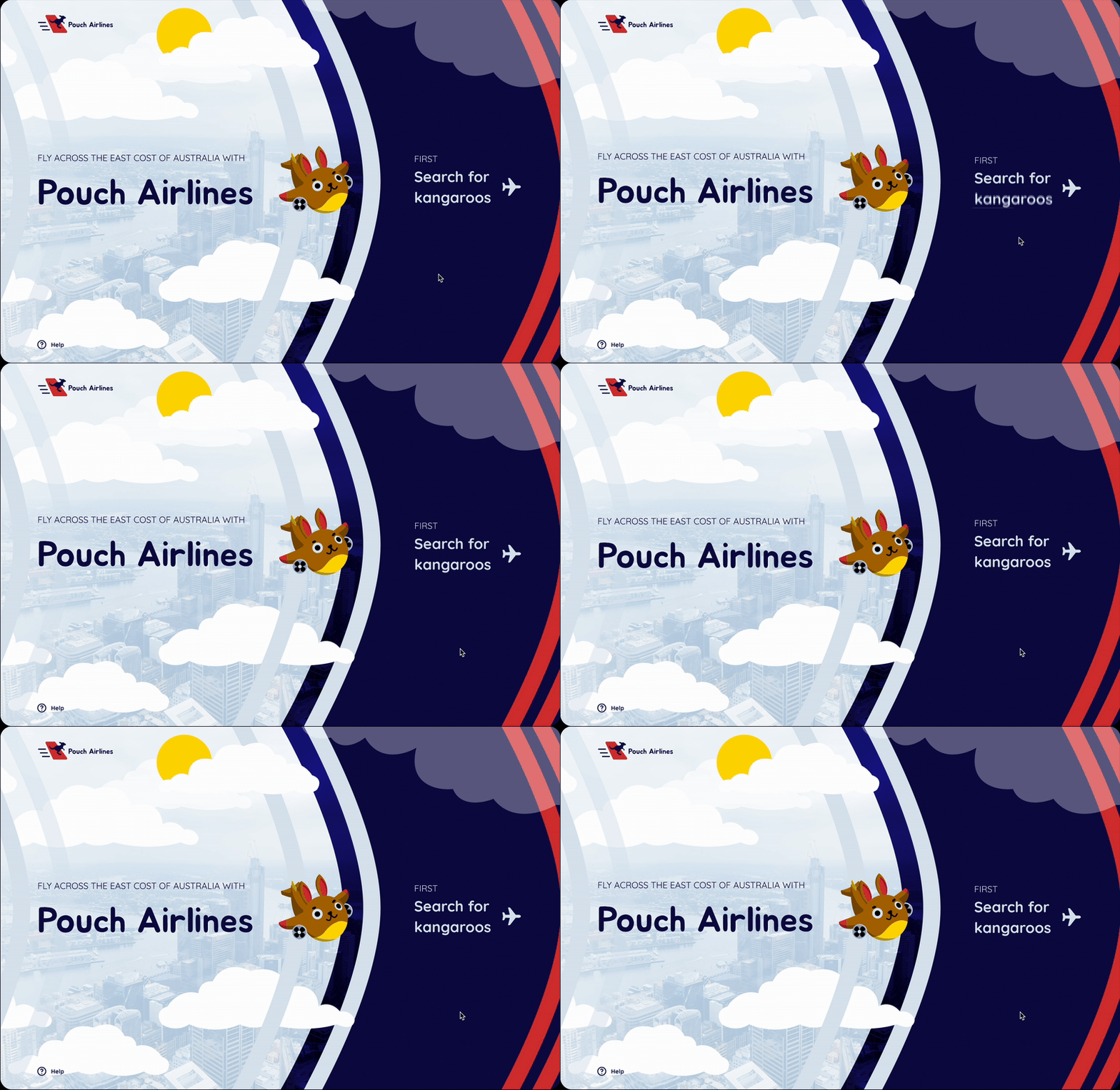
Home screen
Adding subtle motion to each page added life to the design, making it seem more fun and whimsical. Using bounce and easing animations, I created the subtle feel of floating in the air and "hopping" along with a kangaroo.
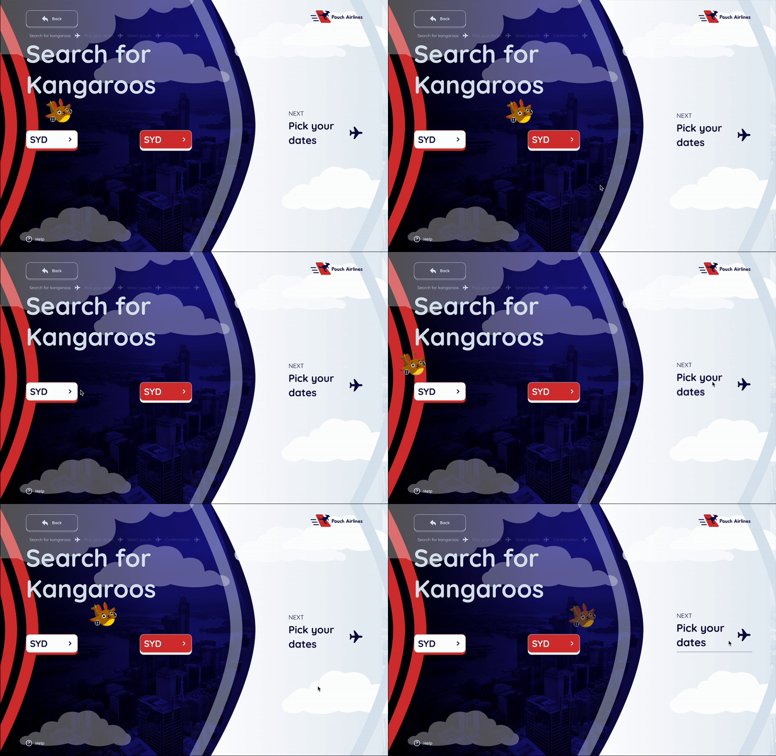
Search screen
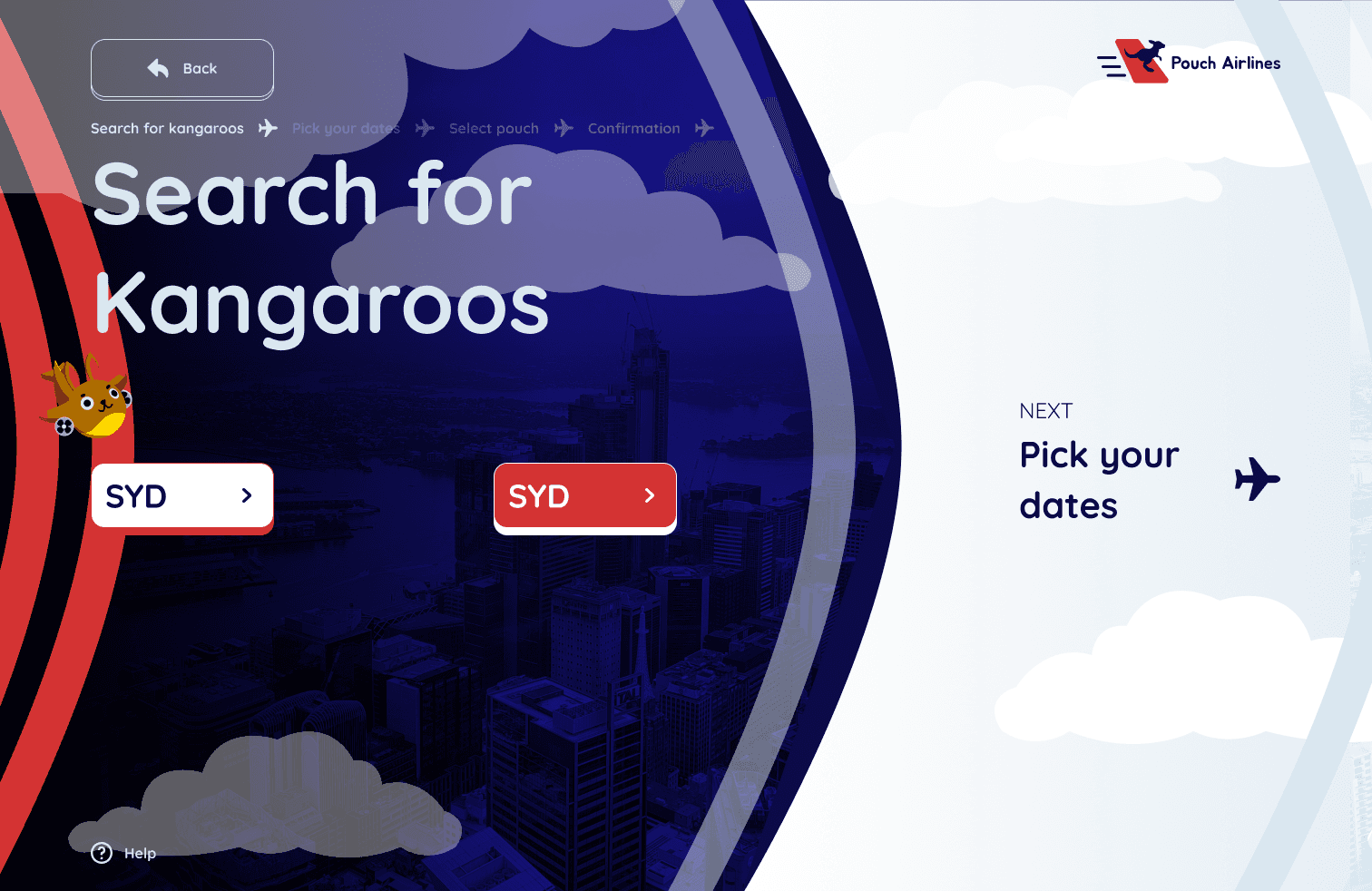
Because the branding is to feel silly inside a kangaroo pouch, airplanes are considered as "Kangaroos" and the user must select a Kangaroo flight from a preferred location to another.
Date picker
The calendar uses variables and conditionals to make each date work no matter which one is chosen.

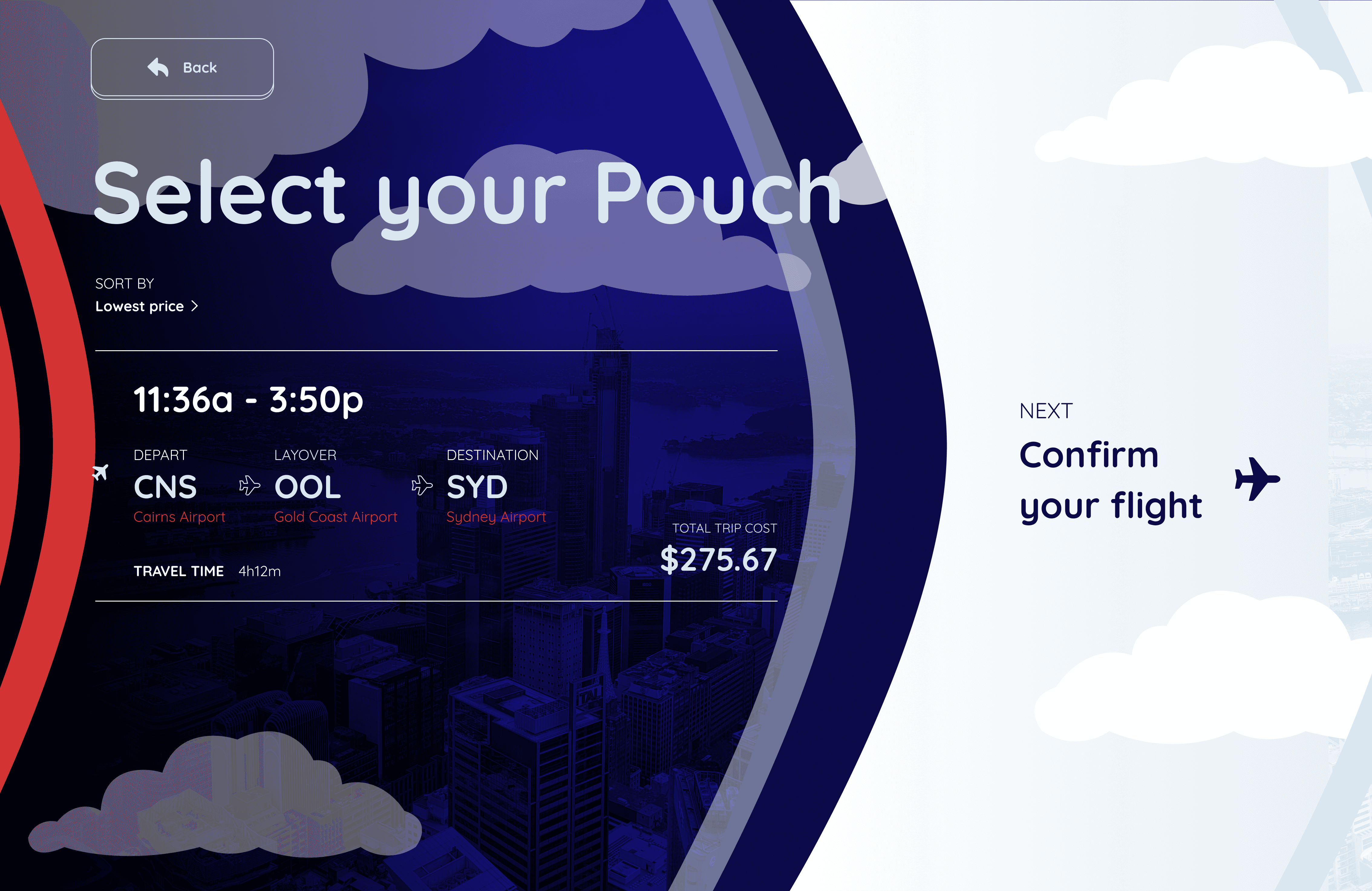
Pouch selector
Though a kangaroo only has one pouch, since an airplane has multiple seats, the user will get a choice of a few tickets to suit their trip needs.
The alternating background colors are a design choice to reminisce between night and day, moving forward through the sky.
summary
A lot of thought and care goes into design systems to make it the most accurate across stating your brand and building around use cases.
Though my project did not go into the deepest details, maintaining brand consistency and creating assets specific to the purpose of my design took a lot of concentration and reasoning behind each decision.
© 2026 Corina Lougie · Designed with room for curiosity