

A 1v1 rave battle game where light, sound, and motion collide!
We designed the full experience as a concept to produce an immersive, handcrafted world that captures the chaos, beauty, and connection of rave culture through interactive play.
Don't want to read? Listen to a brief 1 minute overview of our project. Audio is not necessary, but will increase understanding of case study.
TIMELINE
13 weeks
TEAM
6 designers, 5 developers
ALT CTRL
2 20in bobble heads
As a motion and graphic designer, and illustrator, I helped ideate, prototype, test, and iterate different creative ideas from the design system, character designs, and the user experience.
Jump to…
The Design System

Collaborating with 5 other designers, we established a design system to ensure consistent colors, sizes, typography, grids, and scaling by storing them into reusable assets with Figma Variables.

Process Work

Using Unreal Engine, Blender, Figma, and Adobe Creative Suite, we created a full game within a 13 week time span.
Colors
Typography
Size, weight, and scale.
Grids and Spacing
Components
Buttons, graphics, and logos.
Illustrations
Character designs, idles, and background art.
Colors

Young and bright tones shows excitement, high energy, and consistent neon associated with the branding of our game.

Bright colors are used heavily with neutral to give our game a lively look while maintaining the young and neon young adult / teenage appearance.
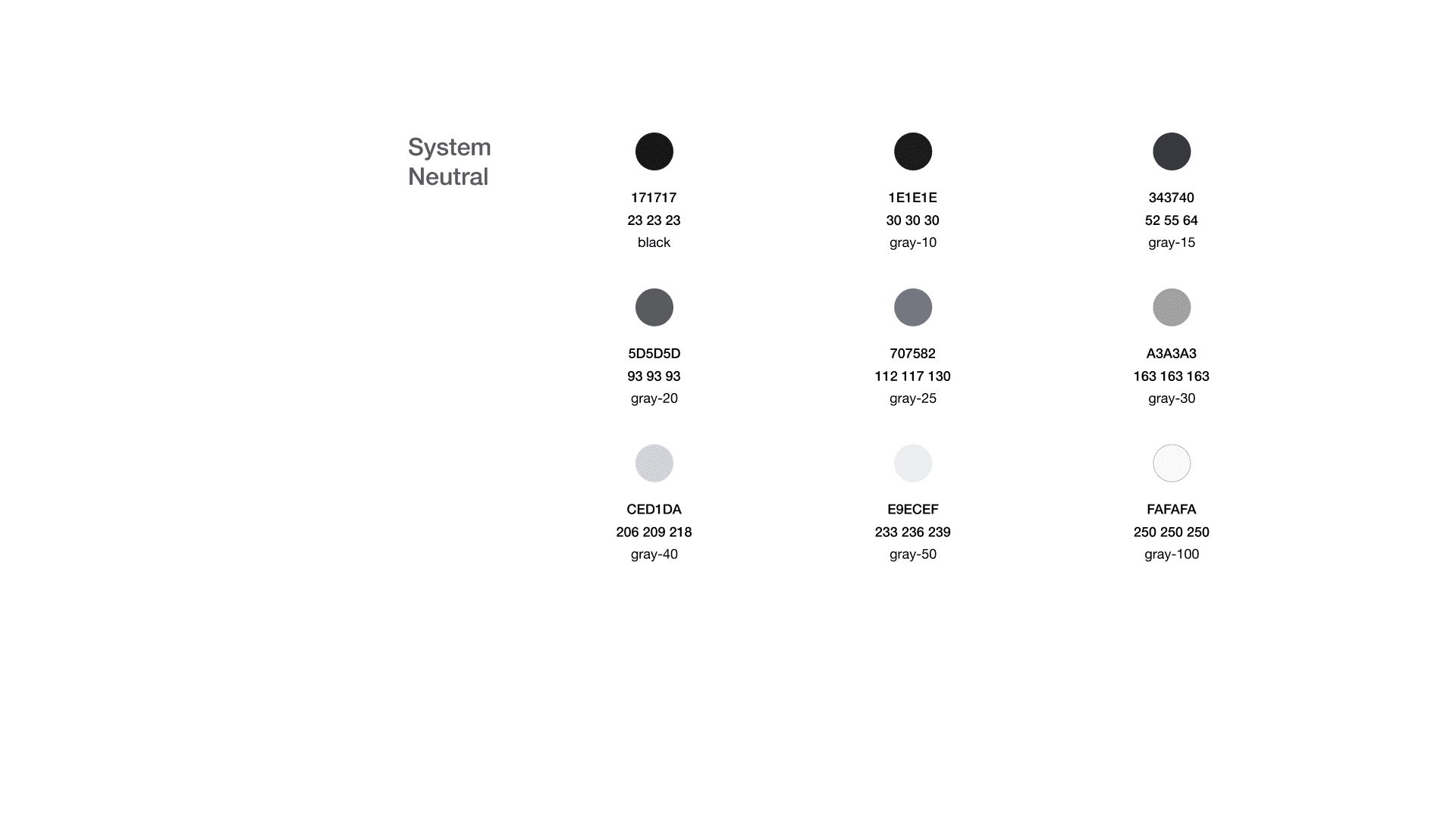
Neutral colors are used for primary branding and general use to combat the overwhelmingness of the neon colors. It is limited to black and white to avoid confusion and color clashing.

Secondary colors follow the same pattern as the primary color palette. These add variation to the color options depending on lighting and environment.
Typography
Easyily legible fonts and sizing, still showing the fun and unique "rave" culture and maintaining a modern feel.
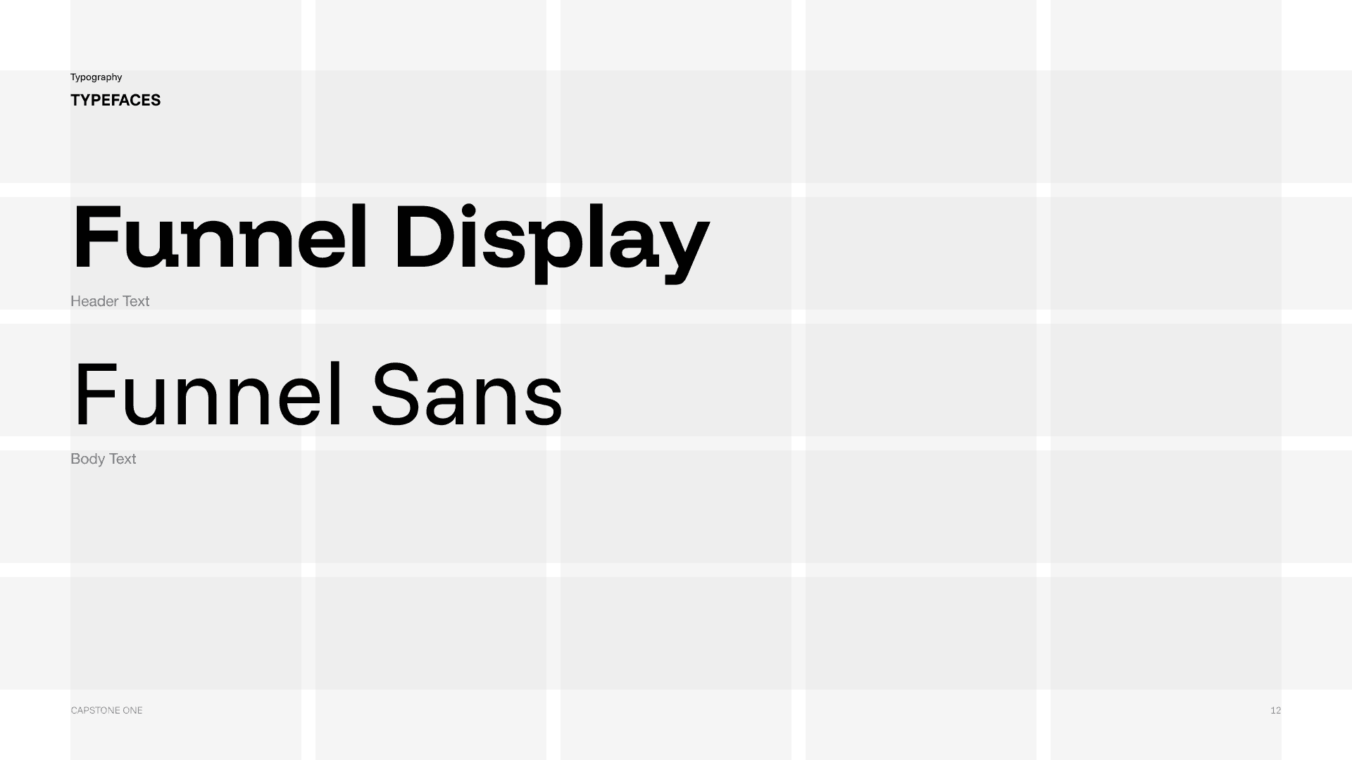
Developed and designed by NORD ID and Kristian Moller, the font was chosen by us for a youthful and refined modern appearance that is dynamic and doesn't stray too far from a simple sans-serif font.
It's paired with Funnel Sans for greater flexibility of paragraphs and smaller text.
Because the game is developed to be on 2 large TV screens and to be played from several feet away like a video game with a controller, the font weight can be no less than 500 for legibility.


Smaller header sizes would be illegible from far away. We stuck with keeping the default settings between the letting and line height.
Grids and Spacing
Default 16:9 ratio screen (1920px by 1080px) using a consistent grid system with 100px margins and 20px gutters. 5x5 grid allows for more flexibility with placement of differing elements.

Components
Easyily legible fonts and sizing, still showing the fun and unique "rave" culture and maintaining a modern feel.
Logo and lockup

Kandi has 3 different logos of the same variant. Each logo represents a different base dynamic and used in different instances of marketing and gameplay.
Each logo is a build off from the default logo, which can be modified with different brand colors and any effects can be added as long as the letters are still recognizable.
The Stroke version features a 3D "y2k" feel from the inspiration of early rave culture. The Star version features a swoosh to add movement and dynamism. The Star and Stroke versions cannot be combined, or it will overwhelm the recognizability of the word mark.
There are several variations of colors that can be used for the logo, as well as the star mark used as a graphic element by itself. Each color can be used with a specific color gradient dedicated to our design system.

BUTTONS

Stored as components in Figma, buttons must have certain padding to them leaving space to breathe without making it too cramped.
Adjustable settings are added to turn on and off the graphic mark and each state for hovered and pressed for each color is stored as different variables for easy prototyping.
characters
Using my skills in Adobe After Effects and Adobe Illustrator, I designed and puppeted animations for idles of our characters: Hype and Wilt.
Characters
2 screens facing each other where 2 players compete against each other to collect the most kandi bracelets. Players play as Hype, the star of the show, and Wilt, an anxious soul with room to vibe.
Both Hype and Wilt were made to be opposite party-goers, showing high energy and sharp lightning motifs vs. Wilt's low energy slouching.


week 1-4
Sprint 1
Ideation and exploration.
week 5-7
Sprint 2
Buttons, graphics, and logos.
week 8-12
Sprint 3
Character designs, idles, and background art.
week 13
Sprint 4
Refine and presentation.
REFLECTION
After project
Strengths and weaknesses.
week 1-4
Sprint 1
With a group of 11 people, we had varying degrees of ideas we all wanted to do or what we thought was possible within our skill level. Our group was picked randomly from 6 New Media Design majors and 5 New Media Interactive Development majors. It took us much longer to come up with an idea we could all agree upon because our group dynamic started off pretty rocky.

Fleshed-out was our original concept. This was a 3 player game where you are a mosquito and you try and suck the most amount of blood in 2 minutes without being crushed or swatted away.
What failed for this idea was the thought of using a blow input for a blood-sucking game. I believed if we still followed through with this idea, it would have been equally, if not more, successful.
Even with the different options we presented, sanitation was a concern from our professors and classmates alike.
There were several ways to bypass this issue because we presented 4 different options that did not use mouth contact.

Limitations of the mosquito concept.
Every project is not perfect, and this was a great opportunity to reflect back on our decisions and realize that this idea had potential. It worked well with the skills of the developers and it was a unique idea that was both fun for kids and adults to be presented at Imagine RIT, a campus-wide event with thousands of visitors.
Our only limitation were the concerning thoughts of everyone else about the project being unsanitary and not making sense concept-wise.
These would have been fairly easy workarounds, but ultimately, it was peer pressure that limited our creativity. This led to us overthinking accessibility and who could use this game, but there are always going to personal feelings and expectations that differ and a creative game cannot always be made for everyone's disability in mind.
We mapped out our project deliverables, limitations, expectations, and framework for getting it done in time prospectively to be shown at 2 events, but this concept was unable to be brought to fruition.
We pivoted toward a completely opposite direction, theming the game with rave culture and rebuilding our idea from scratch.

week 5-7
Sprint 2
The huge switch was personally a let down for me, looking at it retrospectively. I don't want to say that this project was a success, because it wasn't, at least for me. We weren't able to bring it to the finish line and get it as polished as much as we wanted to, but what was important was figuring out how to work with a large group and how to work with differing personalities.
Sprint 2 was more difficult that the first, cramming this new idea into a working prototype, both physical and digital.
Brand and identity shift
Our whole branding switched to the rave themed game, "Kandi". Although it wasn't our original plan, the total switch didn't make any of us lose hope in what this project could become.
We established branding guidelines, a design system, and restructured the social media.
Physical testing and program experimentation
Building the controller out of springs, wood, and cardboard, we used Arduino sensors to connect the tilting input movement to directly affect the movement in the 3D rendered environment (the rave location).


Feedback and user testing
Our feedback was mostly from RIT students and professors ranging from engineers to game designers. We put together a survey after the game play and asked users an assortment of questions that would help us with next steps in the process to creating a more suitable and accessible game.

At the same time, we worked on our visual style with different inspirations and iterations, landing on a y2k concept with bright colors.

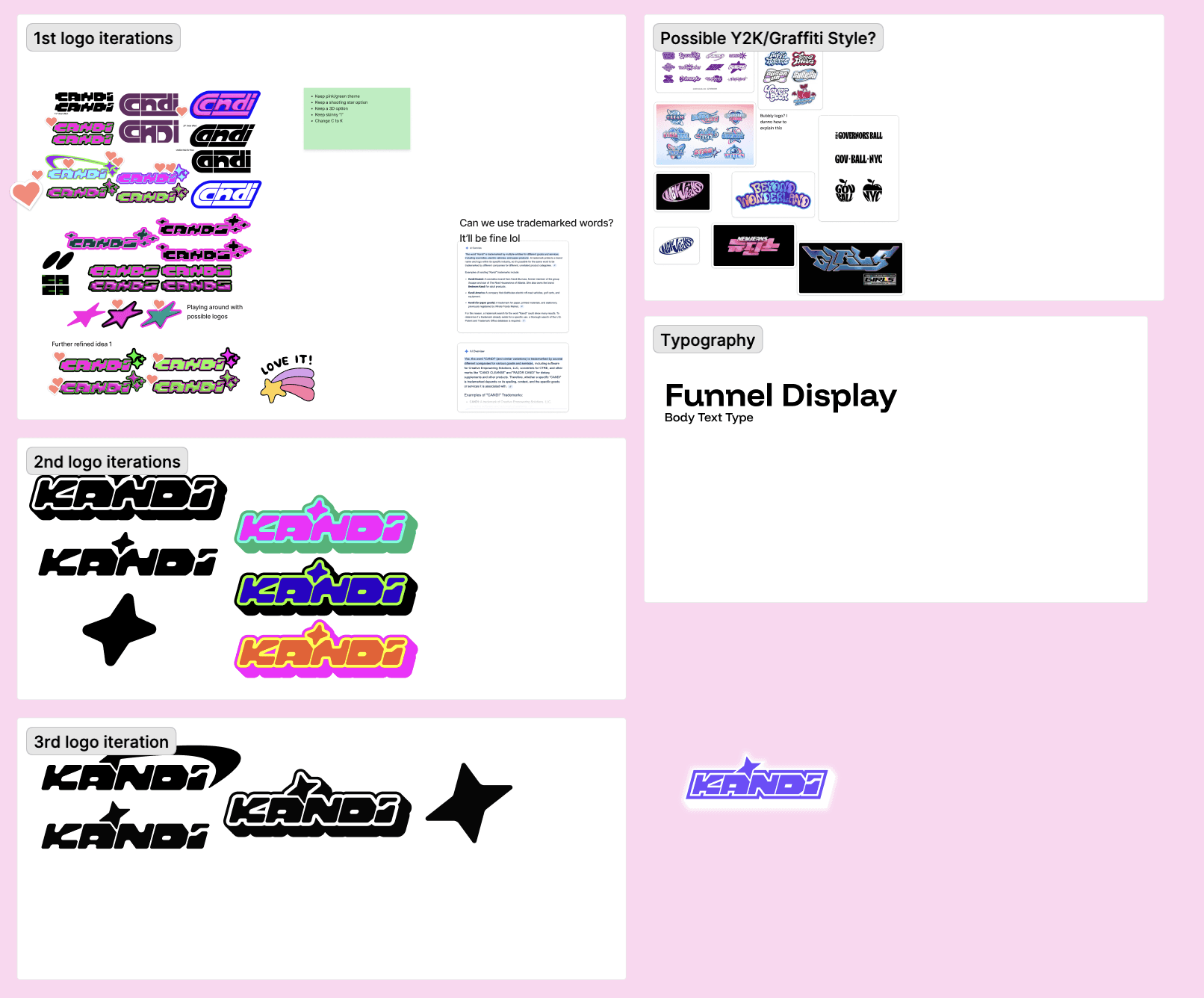
After several iterations and exploration, we landed on a y2k graffiti style logo and word mark to set the vibe of the game.
week 8-12
Sprint 3
We revisited our core mechanics after testing the first prototype. Player feedback showed that the game felt more exciting when framed as a competition rather than a cooperative experience, so we shifted the gameplay toward a 1v1 race challenge that better matched the rave theme’s high energy.
3D model and environment
With the mechanic clarified, we moved into building a higher-fidelity version of the head controller. This version improved stability, responsiveness, and comfort, giving us a more accurate sense of how the final interaction would feel. Alongside hardware refinement, we began designing the user interface.
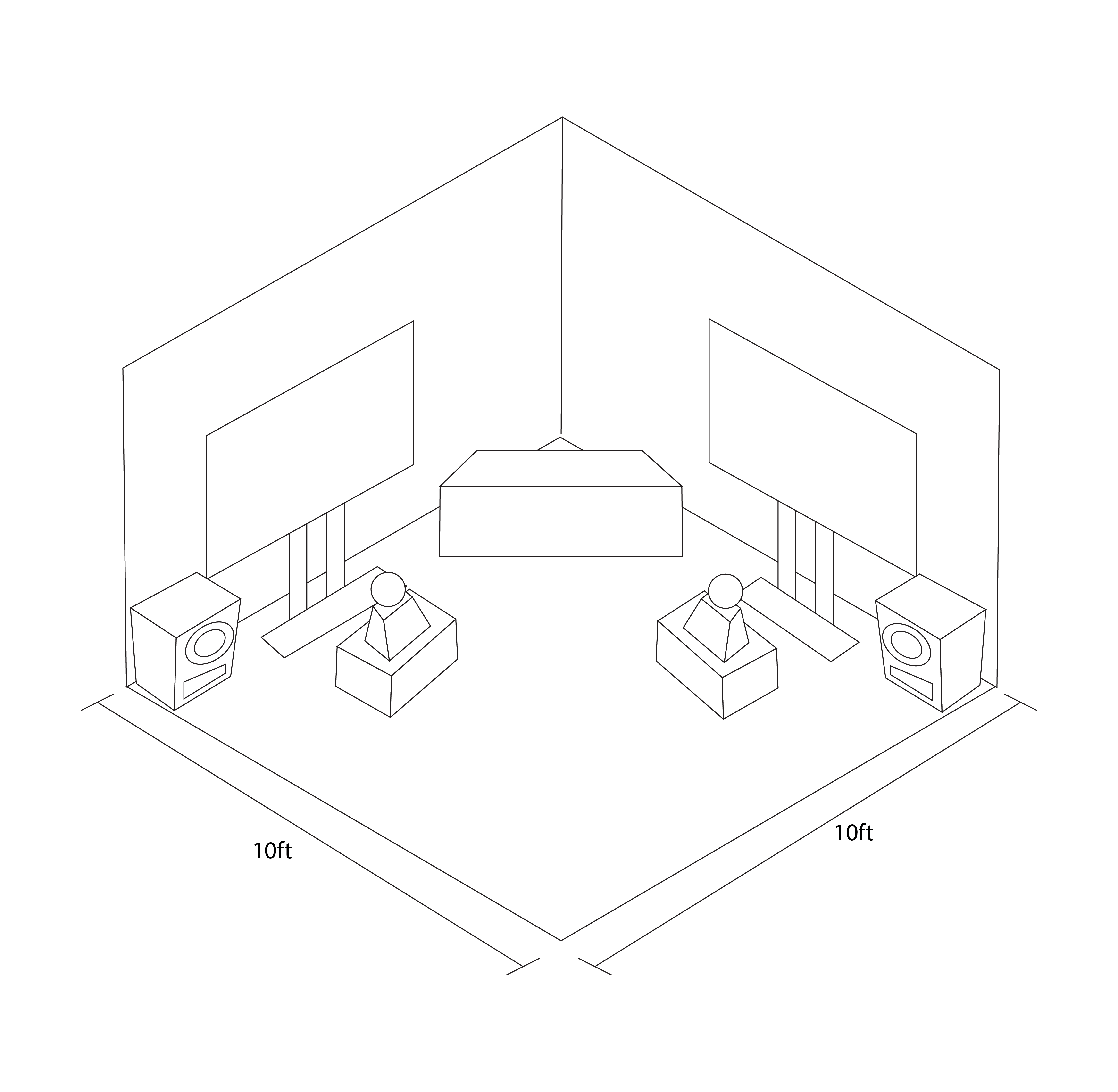
Physical setup
Built for a 10x10 foot square space, competitors would be facing away from each other with a DJ booth in the corner and stereos surrounding.


week 13
Sprint 4
We revisited our core mechanics after testing the first prototype. Player feedback showed that the game felt more exciting when framed as a competition rather than a cooperative experience, so we shifted the gameplay toward a 1v1 race challenge that better matched the rave theme’s high energy.
reflection
Post-project
Although where we left off with the game was a mock-up, learning to work together was a valuable lesson in learning who I am as a person to work with and gaining more empathy for those with differing opinions while still sticking up for my own values.
© 2026 Corina Lougie · Designed with room for curiosity