
Mobile government infrastructure and accessible design system.
I designed a supplementary mobile experienced for the digital ID that feels as secure and reliable as the physical card, overcoming common user distrust in digital state transitions using complex UI, Logic, Security, and Accessibility.
A second version I created that applies to WCAG and the Design Guidelines for New York State and the NYS DMV are applied to enhance the accessibility of the case study.

TIMELINE
6 weeks
ROLE
UX/UI designer
SOFTWARE
Figma, Adobe Illustrator
Integrating an accessible UX and aligning the product with best-practice standards for inclusivity in government services are critical design requirements.
My goals with this project were to create a simple and unique prototype of New York’s digital ID. I wanted to learn more about the design process, including and importantly, design iterations and feedback. This includes taking into account both experienced and inexperienced users.
Jump to…
Version 1

With more freedom of choice, color, and style, the initial process was to create a usable app maintaining motifs of the New York and to not use government branding.

Version 2
After reworking version 1, I recreated the screens into WCAG 2.2 AA compliant screens using New York State branding, while keeping the same functionality of the first version.
Comparing physical and current digital licenses
Both versions officially distributed by the state of New York. The physical license, though the information is all condensed, people are trained to understand where information is at and it's obvious what information there is about you, but the text is small and some symbols are only known what they mean by looking them up.

Their physical license does not display information in the most convenient way for people to view it. The physical ID is difficult to read, difficult to understand, unless properly trained or researched.
The upsides:
Used as a tool needed for every day use
The design is familiar
Clear proof of legitimacy
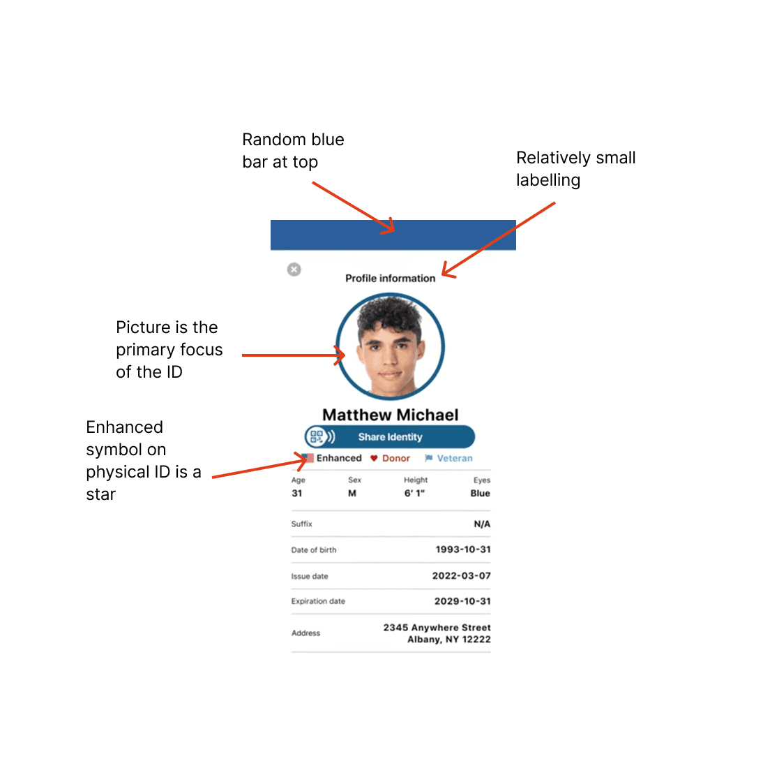
New York State’s current digital ID is unrefined and unknown. There is a lack of identity and individuality focus on New York’s infrastructure and symbols. There are no aspects of "enjoyment" or "fun" implemented to keep the user coming back to use the app instead.
No interactions or transitions
Heavily content focused
UI design is “old fashioned”
No options to limit displayed information
The upsides:
Information is clear to differentiate and see
Clear visual hierarchy
Labels and legitimacy
Comparing physical and current digital licenses
Both versions officially distributed by the state of New York. The physical license, though the information is all condensed, people are trained to understand where information is at and it's obvious what information there is about you, but the text is small and some symbols are only known what they mean by looking them up.
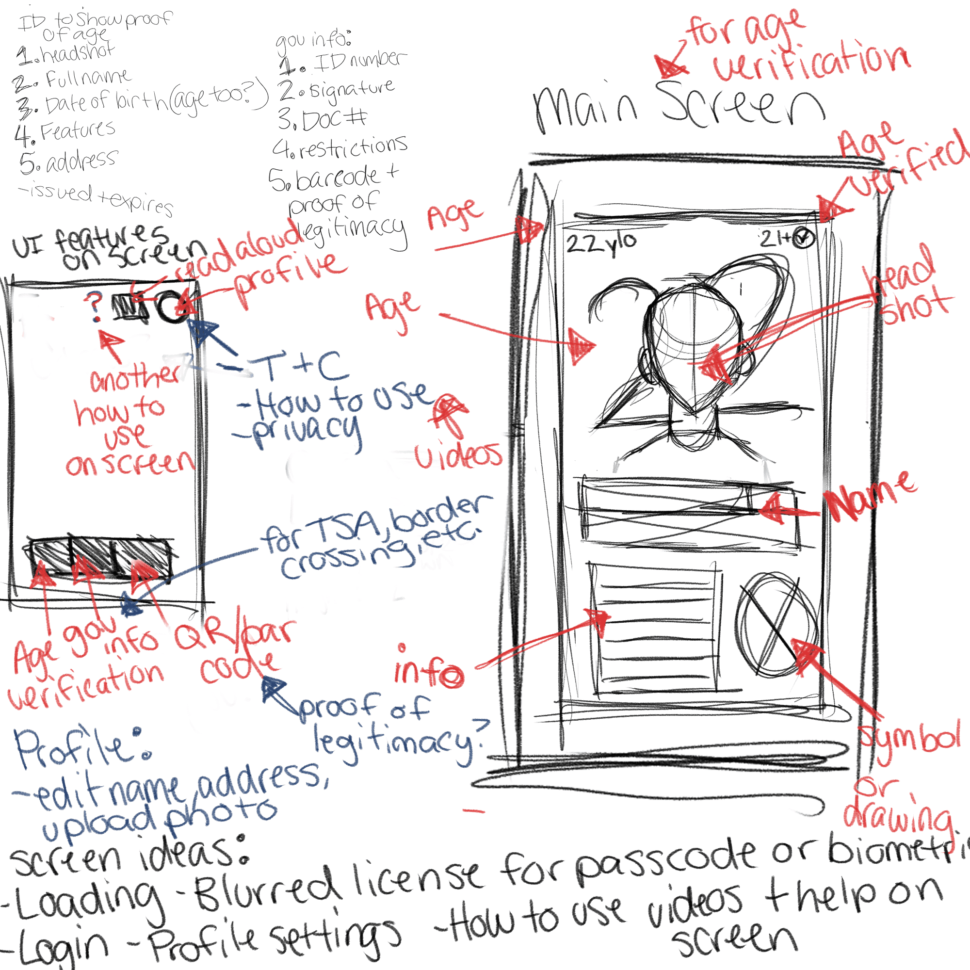
I wanted to include all information possible without cluttering the screens. These initial ideas were taken from past students' work and looking at what the current app has to see what information an app should require for New York.
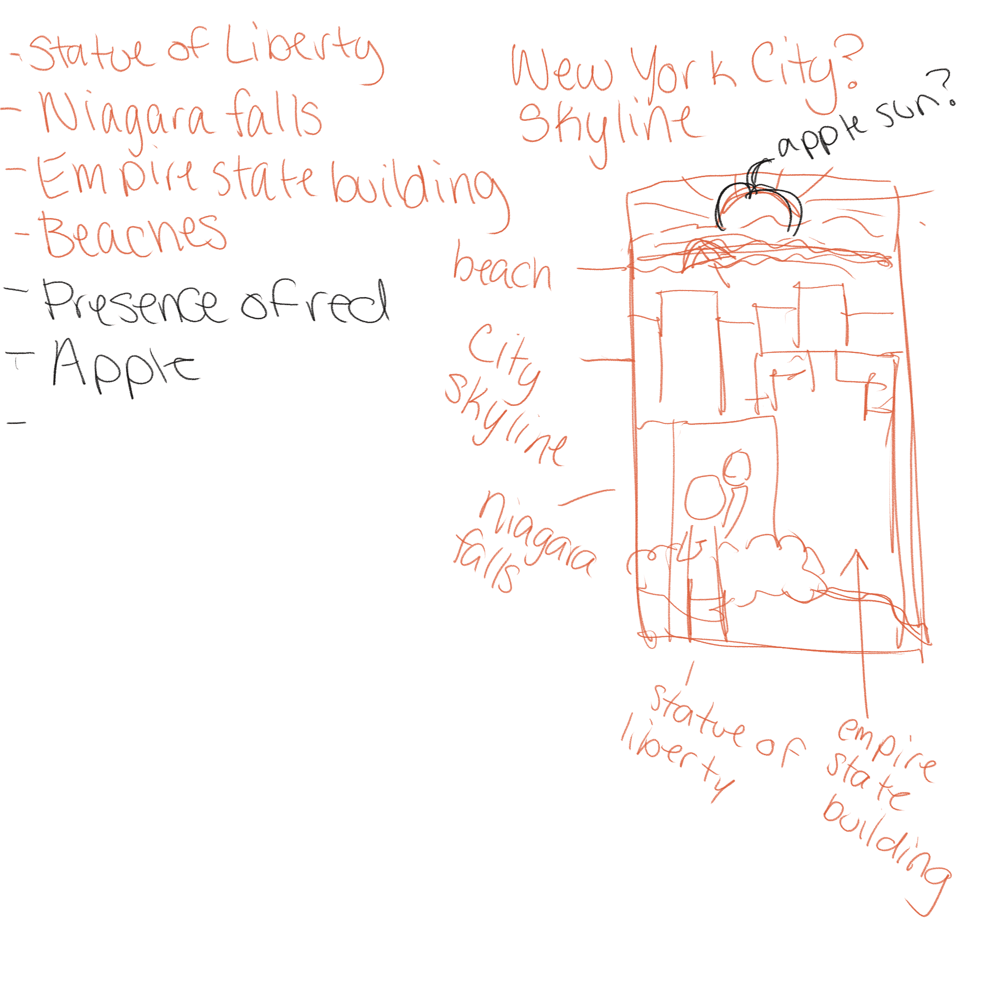
I wanted to implement illustration concepts because that is where my strong points are.
Wireframes
Though we were required to present wireframes as a mid-point to lay the foundations, I found they were not that helpful and the final design greatly diverged from this layout.
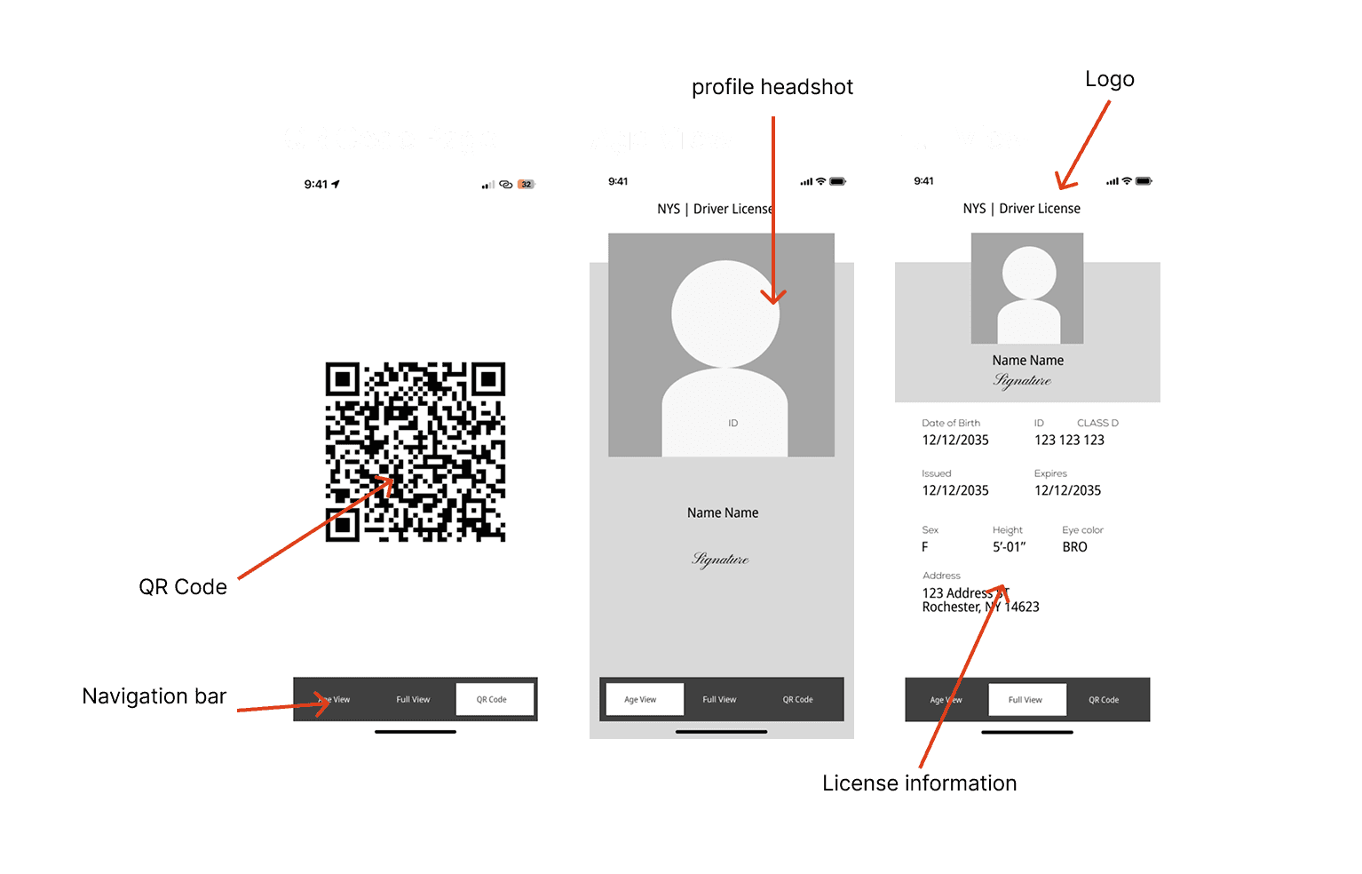
It was super simple in the beginning. It had 3 main features and different views for purposes like showing your age for alcohol or showing the QR code for TSA.
Iterations
There are 6 different significant final designs and changes throughout the last few weeks, presenting my work to the class and referring to professors for steps forward help me overcome the hurdles and specifics of what was wrong with my designs.
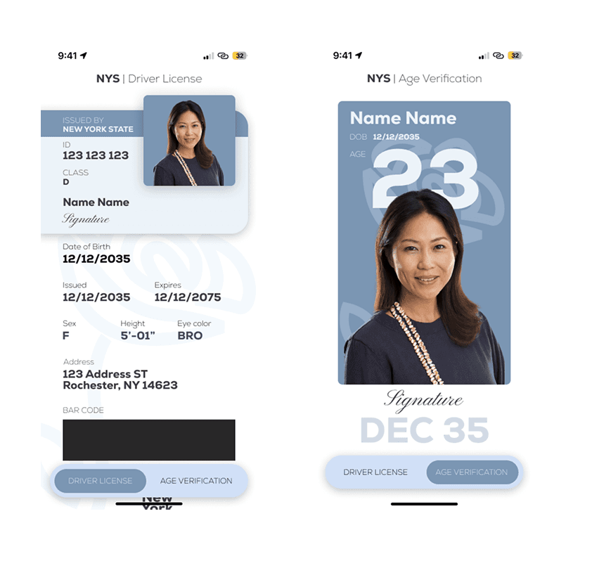
The first mock-up I was told looked pretty good by a few students. By those few students, their work was not very good either. I put a card outline for the basic information and the rest of the less looked at information at the bottom.
I didn't particularly have a reason for the layout, and it was something that my professor caught on to. There was no reason to why information was separated and why the profile picture was in its own separate container. Too many containers and separations could look nice, but functionally, it's confusing.
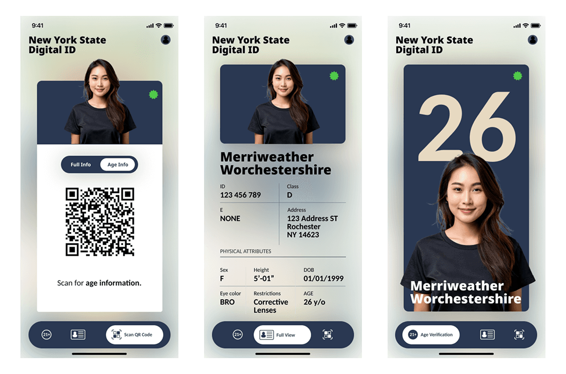
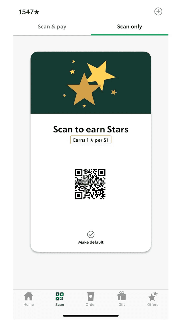
This one also looked pretty nice and I tried to copy a lot of existing containers, like Starbucks' scan to earn stars card. I even made an illustration as the background, but I unfortunately blurred it out because the information was hard to read.
I liked the change in the navigation bar below because it expanded the name of each category, letting the user know where they are.
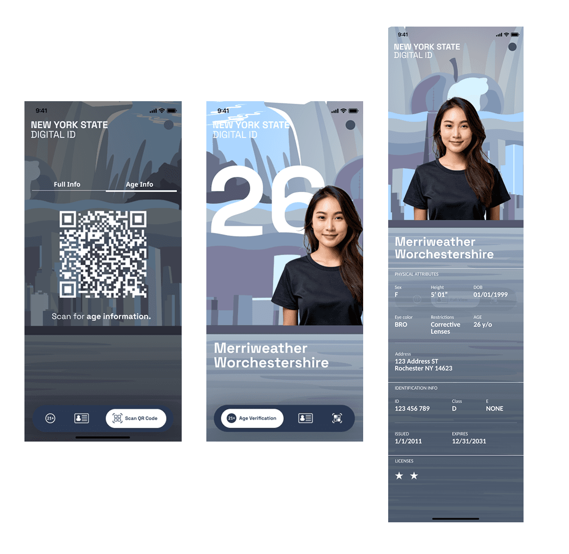
I was basically experimenting with different paths and options I could take, moving back to the sad gray and blue, but ultimately, it looked better as a work of art or illustration rather than a professional ID service.
I moved back to the container ideas and made the colors more accurate to New York and more welcoming. The contrast was bad for this version and the clear glass containers made information confusing.

Solution #1
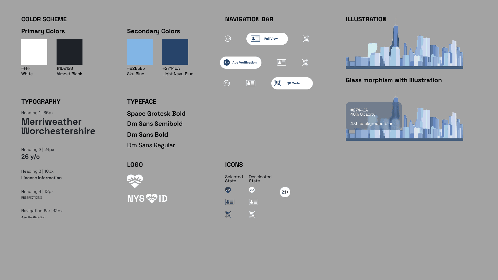
This first solution was without constraints artistically, so I went about creating my own design system for New York.
At-a-glance verification, displays the user's name, photo, and age.
Secondary details are layered behind a tap or swipe gesture
Prioritizing clarity and speed for verifying agents (TSA).
Age-restricted transactions (e.g., alcohol, tobacco) by practicing data minimization.
Displays only the user's name and legally required age, ensuring that all other private information is hidden.
Tiered information display to give the user complete control over their sensitive data.
User selects the appropriate verification level based on the context of the interaction.
Ensures maximum user agency and establishes the app as a trusted tool for selective data sharing.
The opening screen utilizes a dynamically composed cityscape to immediately anchor the user to the New York brand identity.
The off-center placement of the One World Trade Center against the sun creates an asymmetrical, engaging visual field, ensuring the building becomes the dominant focal point.
Solution #1 logos and branding
This first solution was without constraints artistically, so I went about creating my own design system for New York.
Mixture between NY's I <3 NY logo and the Statue of Liberty crown.
Solution #2
The second solution I created within the constraints of New York State's color palette for web design and contrast ratios that adhered to at least AA WCAG.
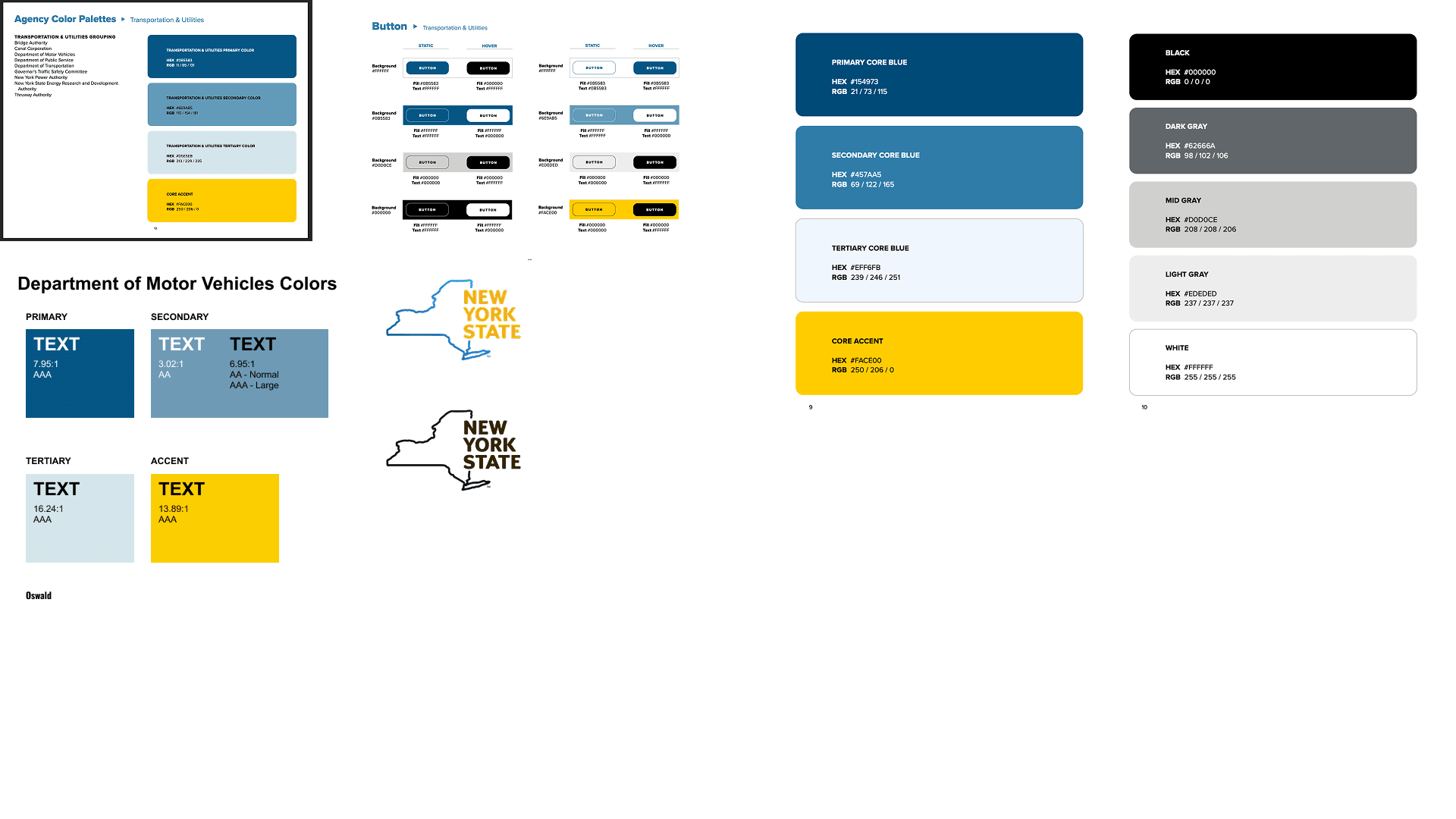
I looked up the branding guidelines for New York. NYC and NY have different palettes, but it was best to use the official government color palette with the DMV colors mixed in as well.
This was when I was testing the flag colors. I ended up not using these specific colors in the final because they were more associated with just NYC.

Solution #2 before to after


I made the text and icons larger and 2 ways to tell you are on the selected tab by underlining the words.
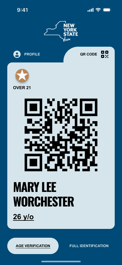


I added a haptic and gyroscope animation to show that it was real and not a screenshot.
Further ideas and potential expansions
2-factor authentication
Sync in real-time with DMV
Further exploration of WCAG Guidelines and how they are applied to real products
© 2026 Corina Lougie · Designed with room for curiosity